My First Project as an Intern: What I Learned From My Mistakes at Saye Konak
The first real project I followed up close as an intern at Diyojen was the website for Saye Konak, a hotel housed in a mansion dating back to 1951 in Antalya's Kaleiçi. In this post, I walk through how a website moves from the brief meeting to launch, seen through an intern's eyes: where I got things wrong, what surprised me and which habits I picked up from the team.
I wrote it for anyone curious about the gap between what you learn in school and what daily life at an agency actually looks like. If you want to see the project itself, you can take a look at the Saye Konak work here.
The brief meeting: taking notes is not the same as writing down decisions
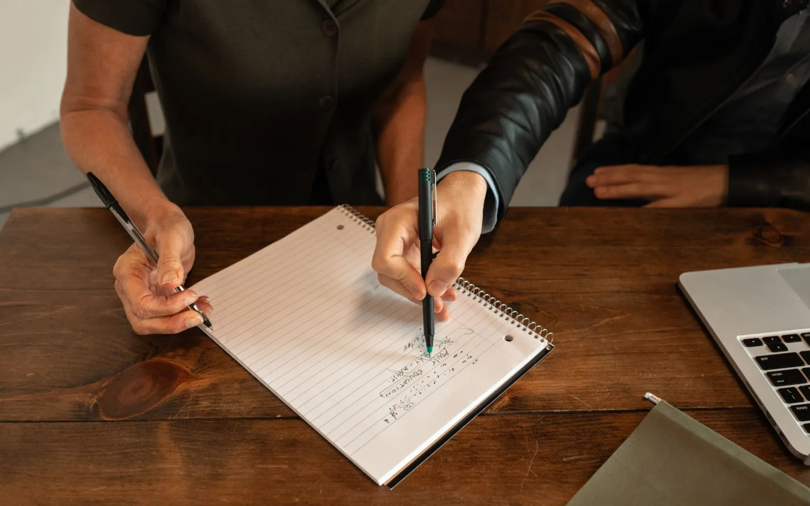
The first thing I learned in the brief meeting was that writing everything down gets you almost the same result as writing nothing down. A brief is the starting document that sums up what a project will do, for whom and why. When I walked out of that first meeting, I had two pages of notes in my notebook, and nearly all of them were adjectives: "warm", "historic", "simple", "welcoming".
After the meeting, someone from our team looked over my notes and asked a single question: "Which of these is a decision?" That is when I realized I had feelings but no decisions. Our team's notes, on the other hand, were short bullet points: which pages there will be, what visitors should see first when they land on the site, who will prepare the content, and what gets delivered on which date.
Since that day, I split my meeting notes into two columns: what was discussed on one side, decisions on the other. If the second column is empty, the meeting is not over yet.
The design phase: looking good is not enough
My biggest mistake during the design phase was judging the screen only by how it looked on my own computer. On a site that tells the story of a historic building like Saye Konak, visuals matter a lot, so I loved filling the drafts with big, striking photos.
One afternoon, our design team opened the draft on a phone. The hero image I had called "striking" cut the mansion in half on the small screen, and the headline landed right on the busiest part of the photo. That was the first time I saw with my own eyes how a page that looks flawless on desktop can turn into something completely different on a phone.
The habit I picked up from our design team is simple: look at every draft on a phone first. Mobile-first design means a page is planned for the small screen first and then expanded to larger screens. It sounds technical, but at its core it is just the thought that "guests will most likely open the site on the phone in their hand."
Development: the invisible work takes the longest
What surprised me most during development was how much time went into work that visitors will never notice. Tasks like shrinking image sizes so the page loads fast, writing alt text for every image and checking that buttons are clickable on every screen look small on a list, but they can take up an entire day.
I made a mistake here too. I had dropped in placeholder text to fill a section on the test page and then forgot about it. Our development team caught it during review, and I fixed it with my cheeks burning. Since then, I always mark placeholder text with the same easy-to-search word, so I can find all of it with a single search before launch.
I wanted to gather the mistakes I made and what I learned from them in one table:
| The mistake I made | The lesson I learned |
|---|---|
| Filling brief notes with adjectives | Splitting notes into "discussed" and "decisions" |
| Judging the design only on desktop | Looking at every draft on a phone first |
| Using large images as they are | Resizing images before uploading them |
| Forgetting placeholder text | Marking placeholder text with a searchable word |
Launch day: the checklist at 5:40 PM
The most important thing I learned on launch day was that a site has to go through a checklist before anyone calls it "done." Launching means the site leaves the test environment and goes live at an address everyone can reach, which means mistakes that are fixable but embarrassing can end up in front of everyone.
At 5:40 PM, our team opened a list and read through the items one by one. Here is what was on it:
- Do the links on every page go to the right place?
- Does the menu open properly on phone, tablet and desktop?
- Are page titles and descriptions written for Google?
- Is the contact information the same everywhere?
- Is there any placeholder text or image left over from the test environment?
As the last item was read out, someone from our team turned to me and smiled. I knew exactly what they meant. This time I ran the search, and nothing came up. It felt like a small victory.
The last thing that surprised me was that the work did not end after launch. Over the following days, our team kept opening the site on different devices and checking it. The day a website goes live is really the first day people start using it.
In short
- In a brief meeting, you need to write down decisions, not feelings; splitting notes into "discussed" and "decisions" helps a lot.
- As I learned on the Saye Konak project, a design should be evaluated on a phone first.
- Invisible tasks like image sizes, alt text and button checks are the ones that take the most time.
- A written checklist before launch catches small but embarrassing mistakes.
- Launch day is not an ending; it is the beginning of the site's real life.
Watching this process from the inside as an intern showed me just how many small decisions sit behind a single website. If you are curious about how those decisions get made, you can take a look at Diyojen's web design process.